Digital
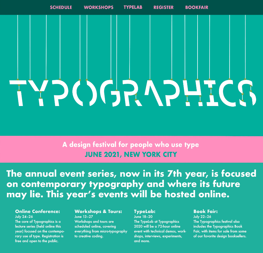
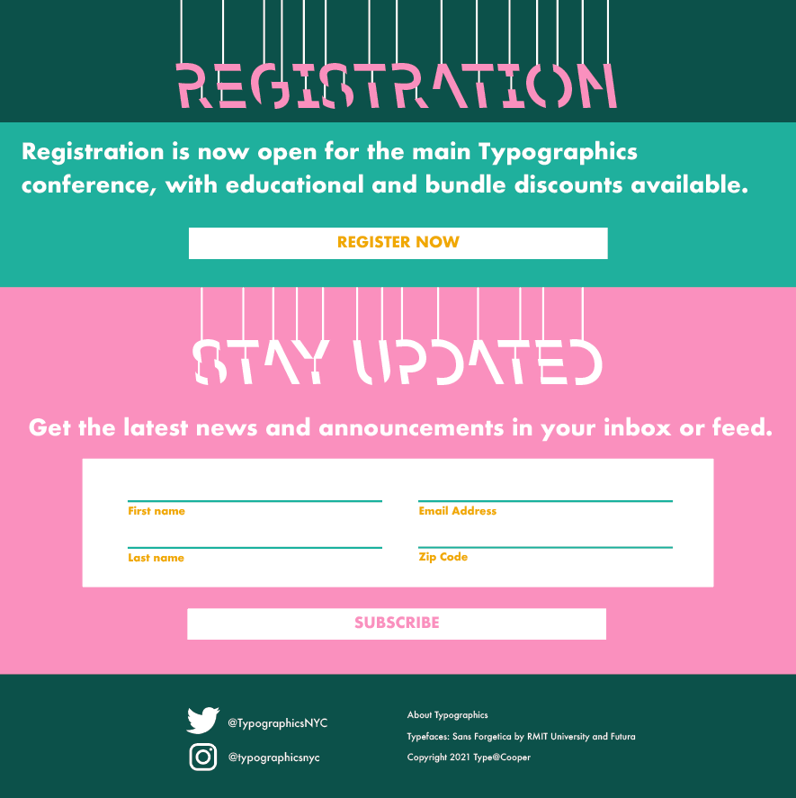
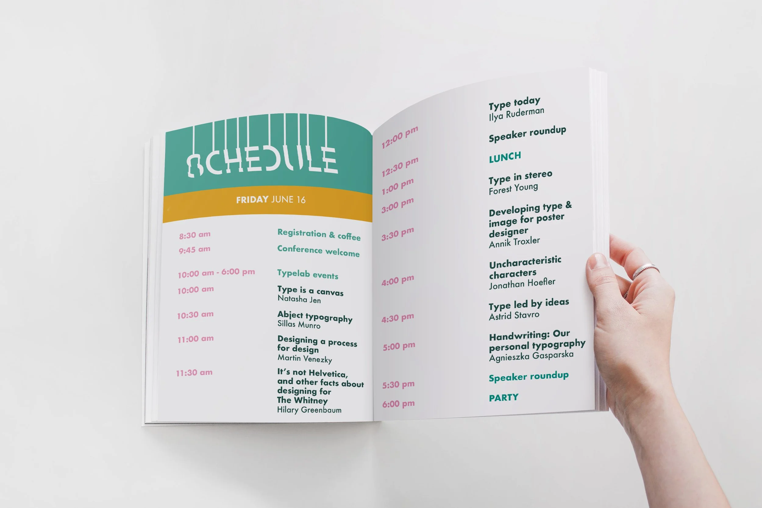
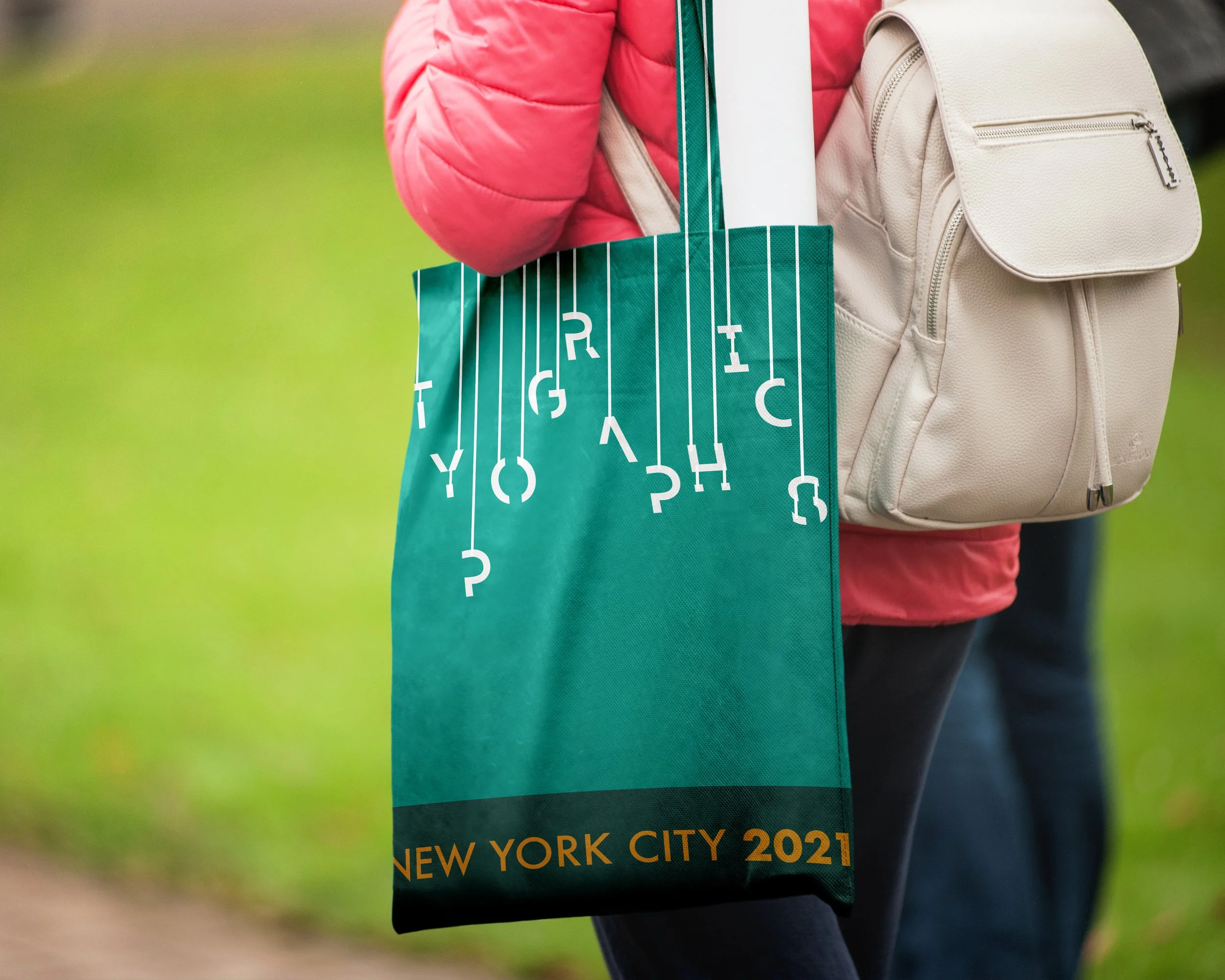
The complete package: Typographics Conference
Katranji Institute is a parent company for Katranji Hand Center. The client was targeting general care practitioners to refer their patients with injuries or medical conditions ranging from the hand to shoulder.
Mailer


Brainstorming
The blue and green brand colors were set in place. These saturated colors needed a softer accent.
The Issue at Hand
Hierarchy of important text mixed with graphic elements. I am a sucker for utilizing geometric shapes to
The best part—colors!
As for a color scheme, I really challenged myself with selecting a bright and vivid palette (I tend to gravitate to darker or muted colors). If I had to name the colors I selected, they would be Mac ‘n’ Cheese, Bubblegum, 90’s Binder Teal, and Deep Clover. The Mac ‘n’ Cheese navigation bar changed to Deep Clover and I found other ways to accent with the bright yellow color.
Rack Cards


Brainstorming
The blue and green brand colors were set in place. These saturated colors needed a softer accent.
The Issue at Hand
Hierarchy of important text mixed with graphic elements. I am a sucker for utilizing geometric shapes to
The best part—colors!
As for a color scheme, I really challenged myself with selecting a bright and vivid palette (I tend to gravitate to darker or muted colors). If I had to name the colors I selected, they would be Mac ‘n’ Cheese, Bubblegum, 90’s Binder Teal, and Deep Clover. The Mac ‘n’ Cheese navigation bar changed to Deep Clover and I found other ways to accent with the bright yellow color.


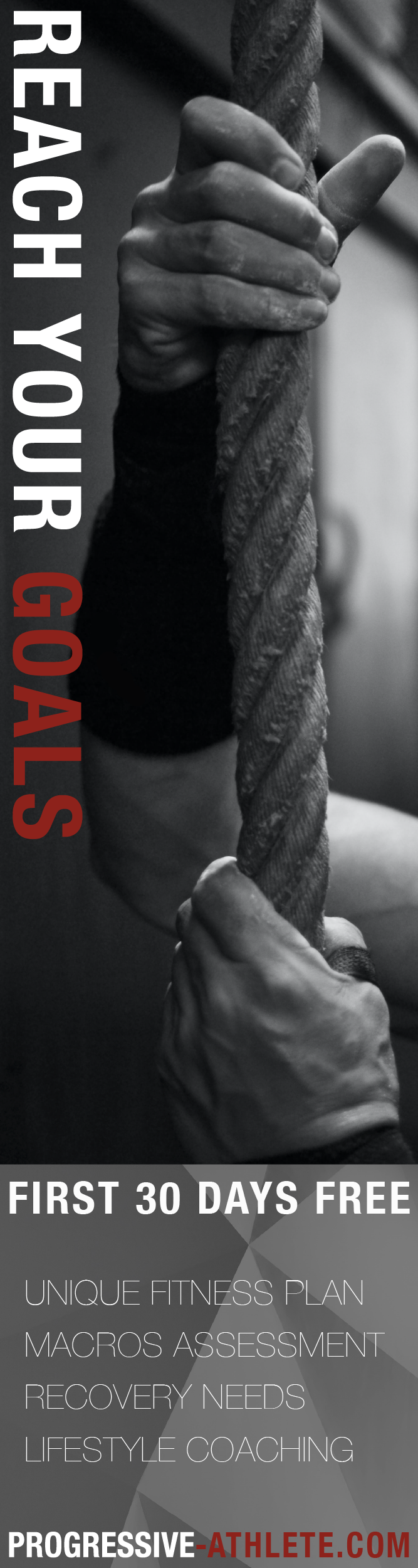
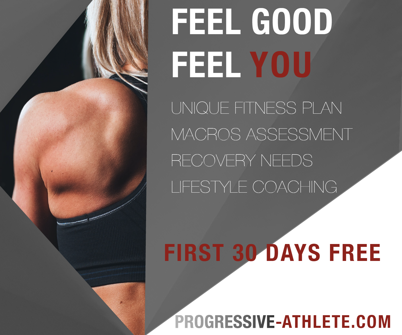
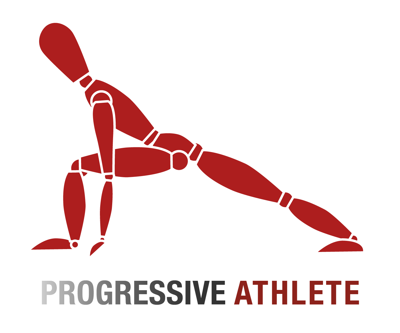
A split decision in design: Progressive Athlete
My good friend and aspiring personal trainer, John Valentine, was ready to get his grind on (is that a workout joke?) and become a professional wellness and fitness coach. Valentine was in need of a logo and promotional social media images. I began on one route of graphic styles, then veered elsewhere…

Logo evolution
Valentine’s logo request was pretty straightforward—a black and white gradient with red as the accent. My first attempt at making a pixelated logo was too meticulous. For the smoother gradient, I used light and dark gray for better readability. One of my favorite subtle, but effective, typographic tricks is increasing tracking. In this case, “athlete” was given more space than “progressive”. Ultimately, the smoother gradient logo won over my client.
Marketing material
Next, I began working on web advertisements. Black and white fitness photos and high contrast shadows paired with all caps added an air of confidence and strength to athletic images. With composition in mind, I selected and cropped photos based on common web ad dimensions.
A different direction
After editing and tweaking the ads, I changed my mind completely! I wanted to create something different than commonly seen fitness ads. I started thinking about mobility and the human form. I wanted to draw something that I could see printed on a t-shirt. I thought of the wooden mannequin in different fitness poses and began sketching on my iPad.
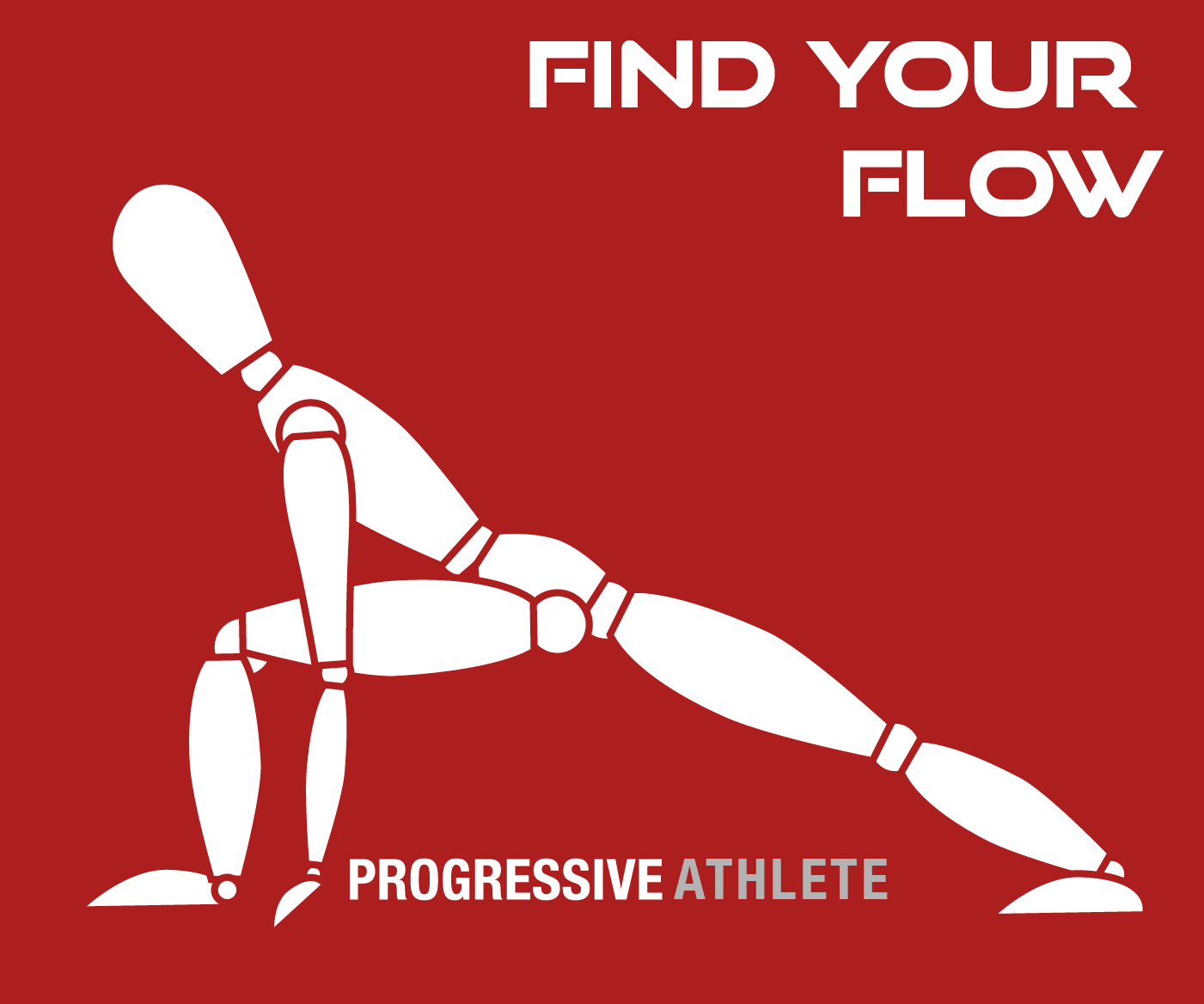

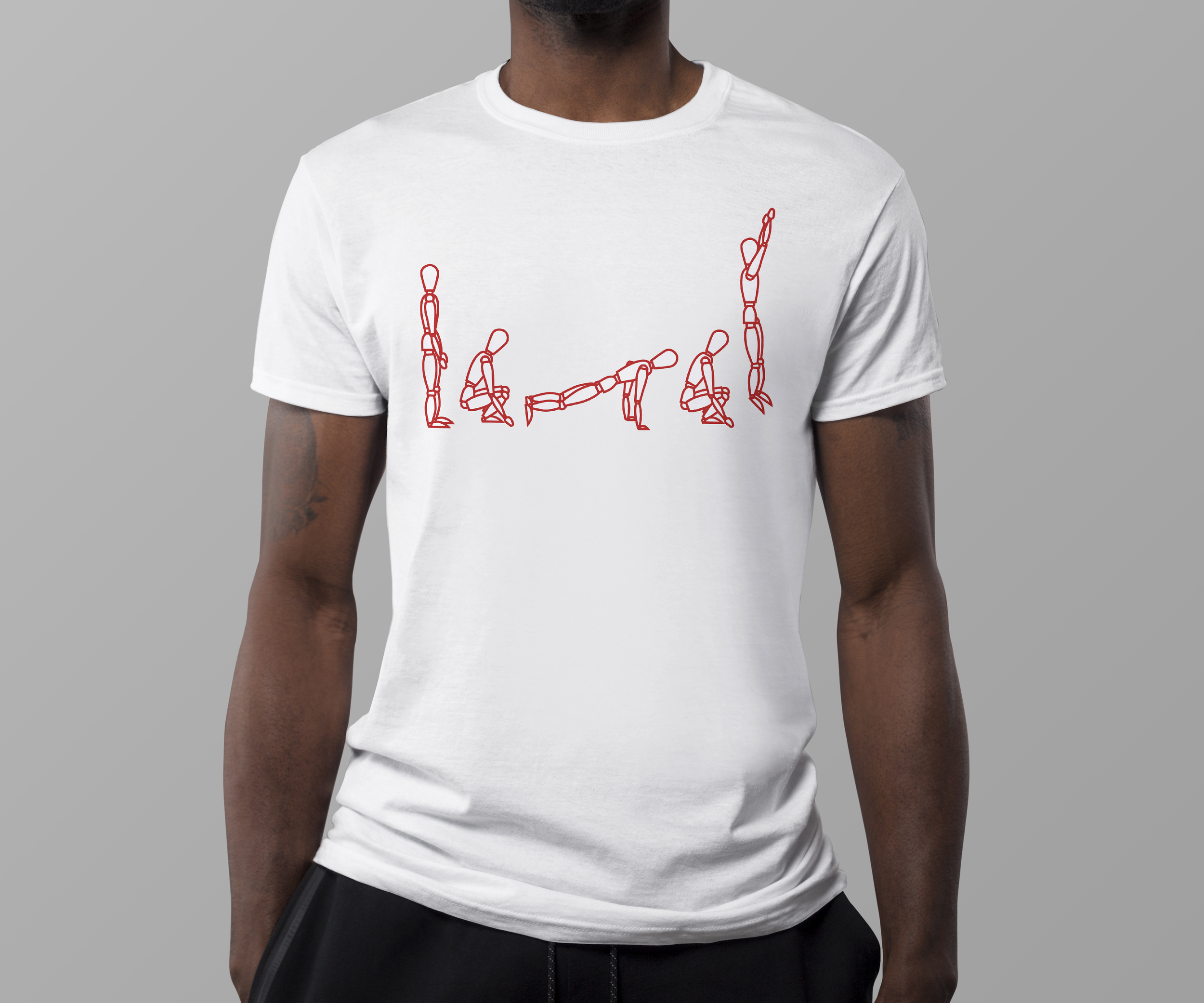
Which design won?
After making edits with Illustrator, I had a finalized ‘mannequin athlete’ with accompanying text. Valentine liked both the originals and the new designs. We had agreed that there was space to implement both. This made me realize that multiple styles or aesthetics are sometimes the right answer. Having one rigid style can be limiting and can lack personality.
Printable
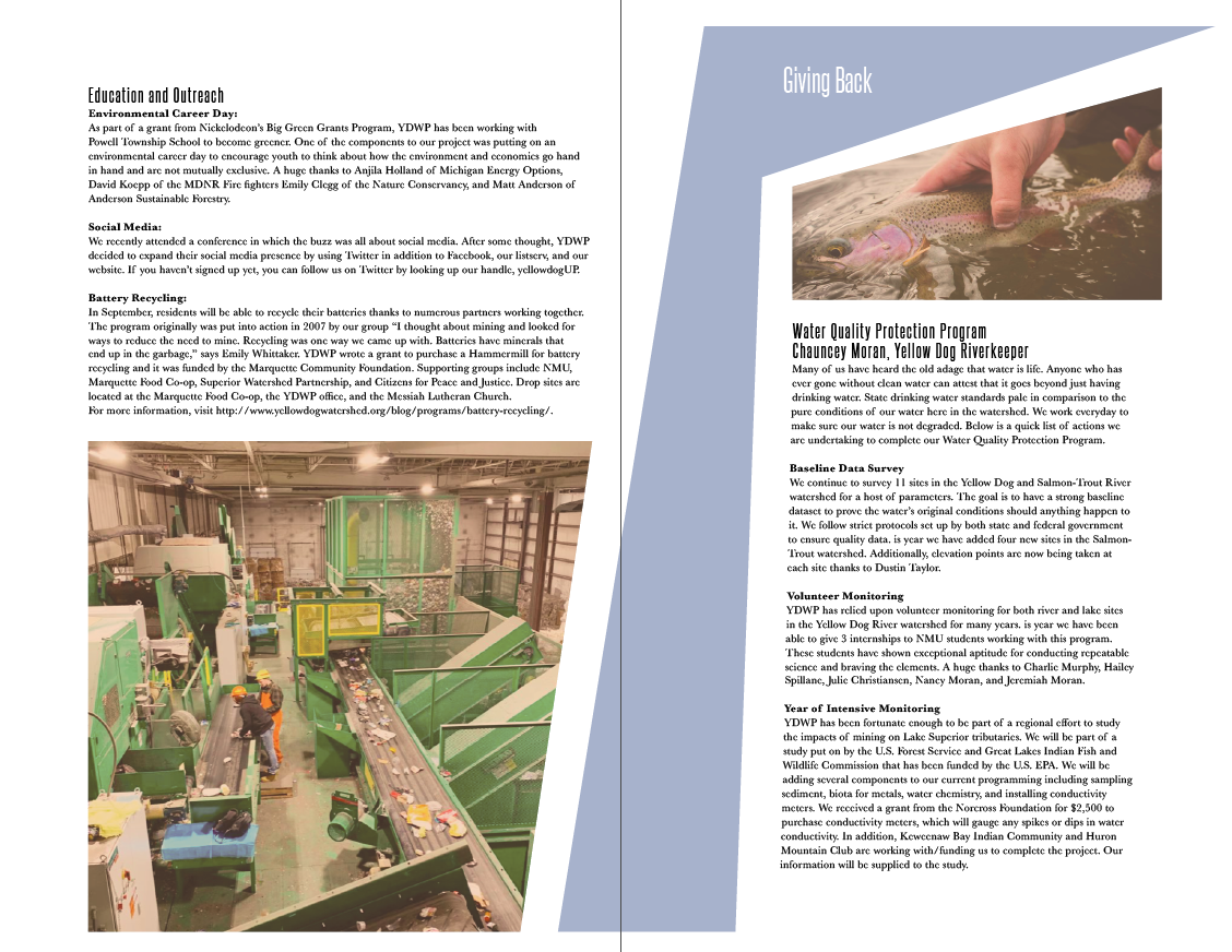
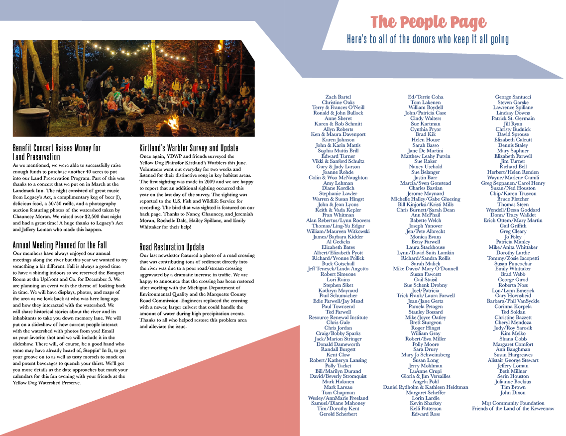
Newsletter: The Howl
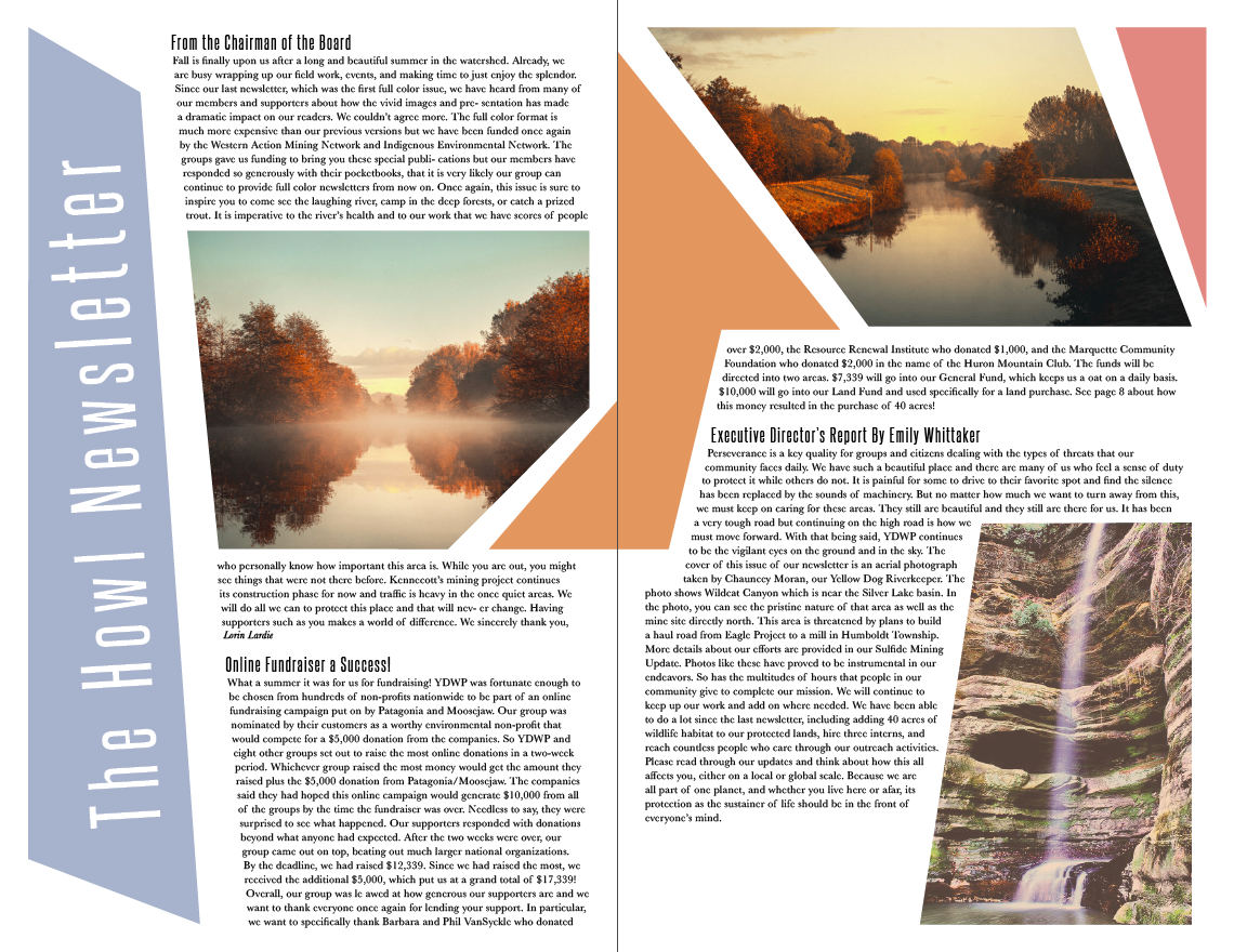
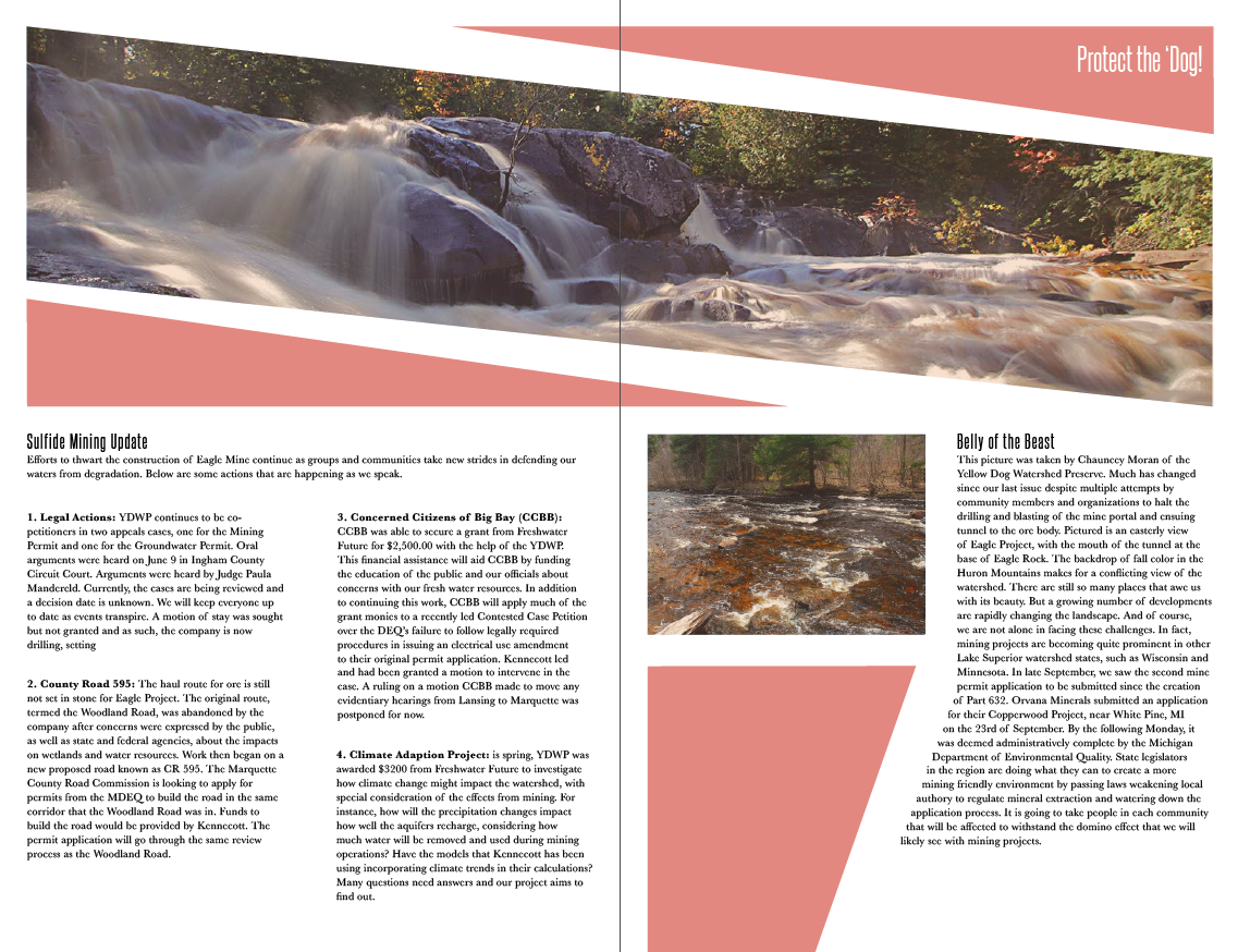
The following is a re-design of The Howl newsletter. The Howl is a Michigan-based newsletter informing the community of the Yellow Dog Watershed Preserve’s current and upcoming projects and developments.
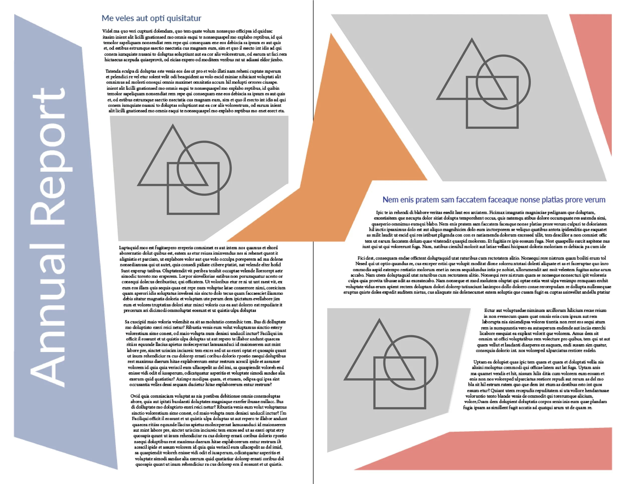
Building the Layout
With such large bodies of text throughout the newsletter, I wanted the blocks and images to be complimentary not dominant. I began sketching spread designs supported by a pleasant color palette. To break up the copy, I incorporated multiple blocks of colors to each spread.
Supporting photography
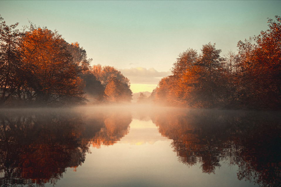
Because the newsletter focused on preserving the outdoors, I collected images of nature or ones that were related to the article’s subject matter. I had to be smart about choosing photos that suited Michigan’s landscape. For example, no mountains should be in the background! Proper decision making and being picky or selective goes a very long way in design.
Modifying the structure
Initially, the blocks from my rough sketches were uniform and I played around with more interesting polygons and softened the colors. I cropped my photos into similarly abstract shapes as well. As for typefaces, I chose a condensed style for headers and a wider set display type for a balanced contrast.

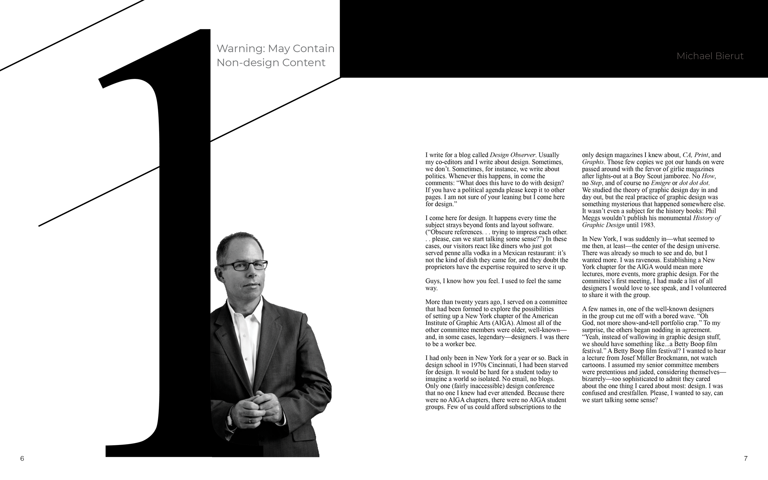
Designing for a designer: Michael Beirut essays
Michael Beirut’s Seventy-nine Short Essays on Design is a mix of storytelling, perspective, and advice as a renowned graphic designer. His collection was condensed into this version, dubbed, Five of Seventy-nine Short Essays on Design.
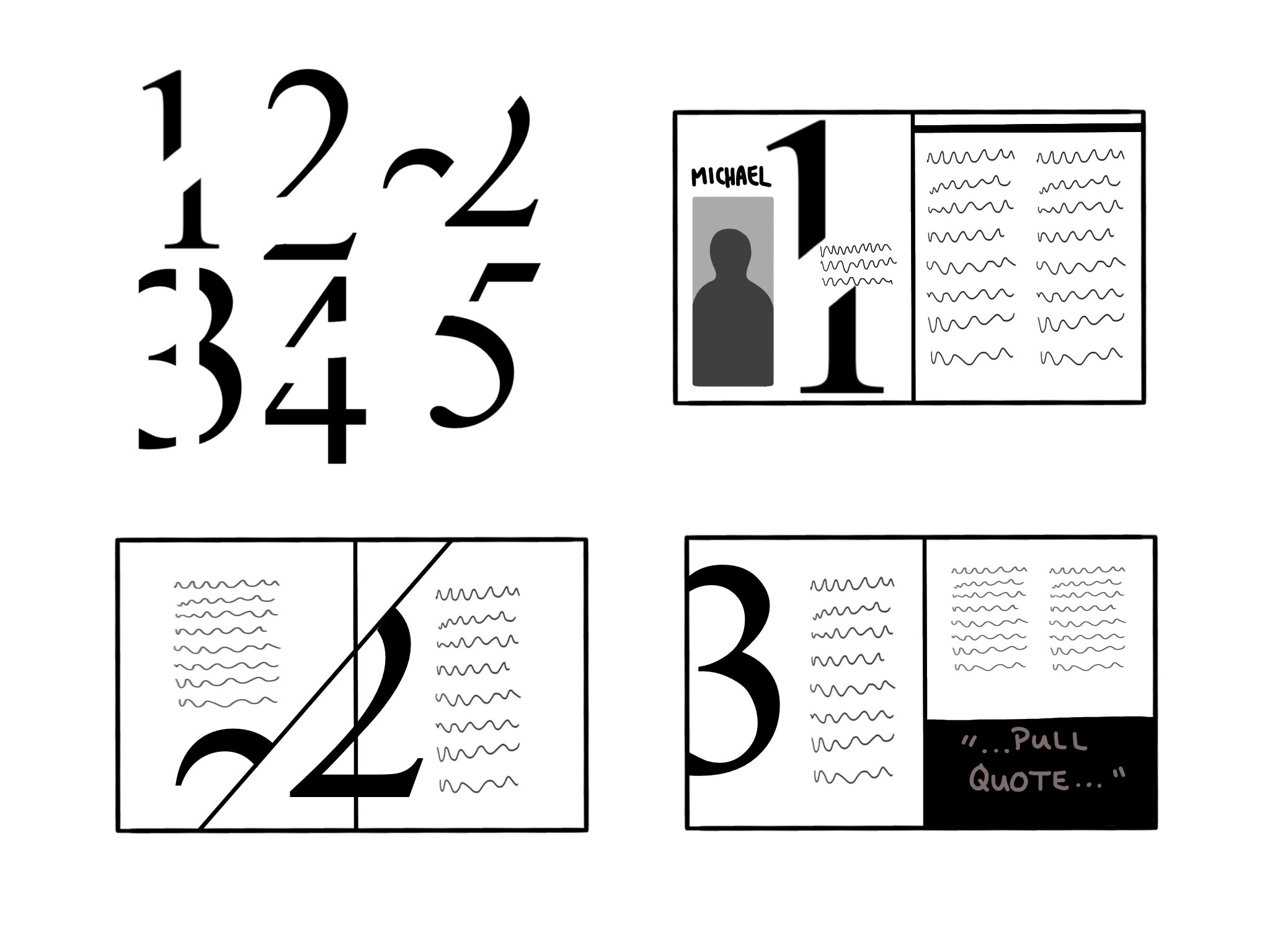

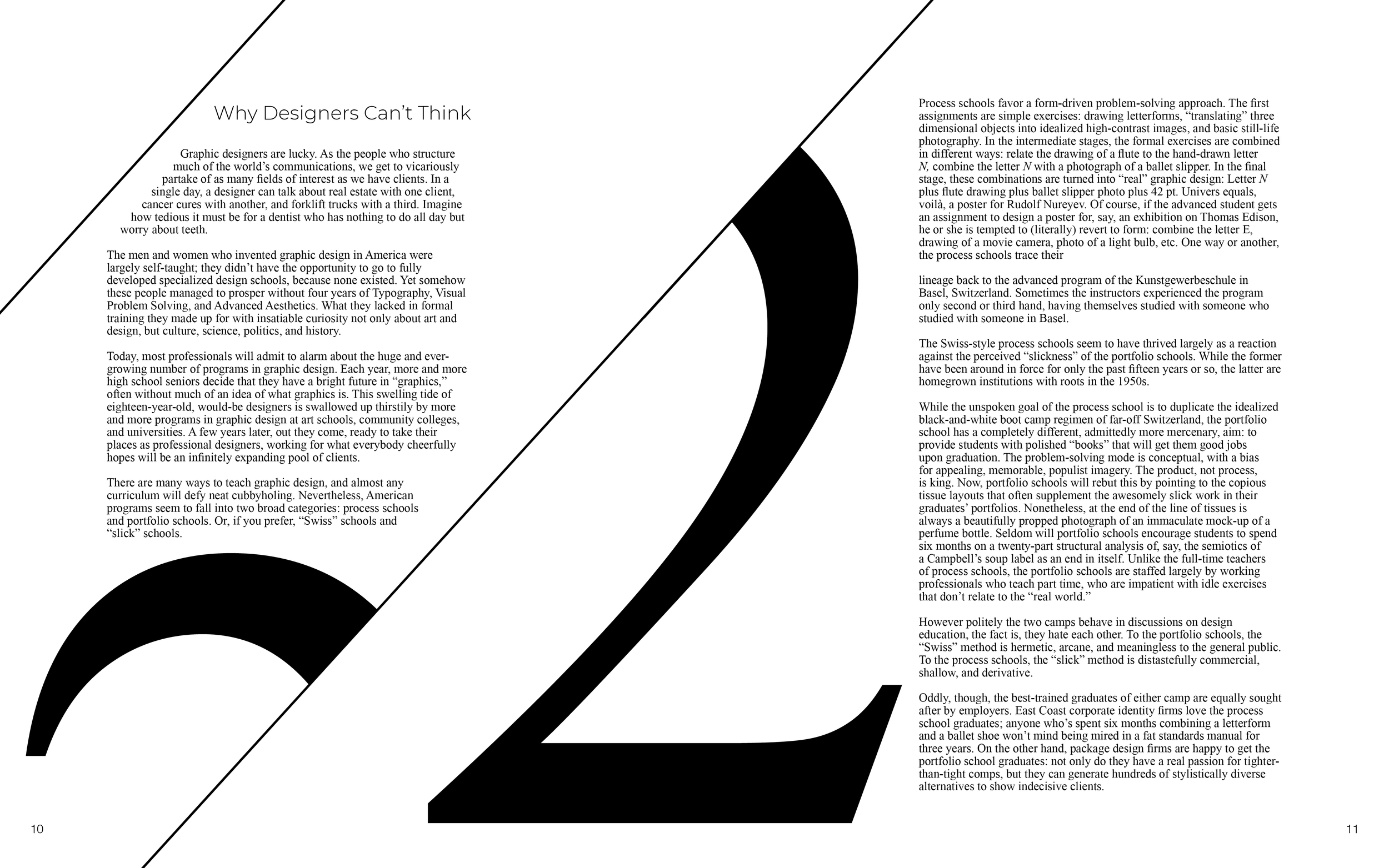
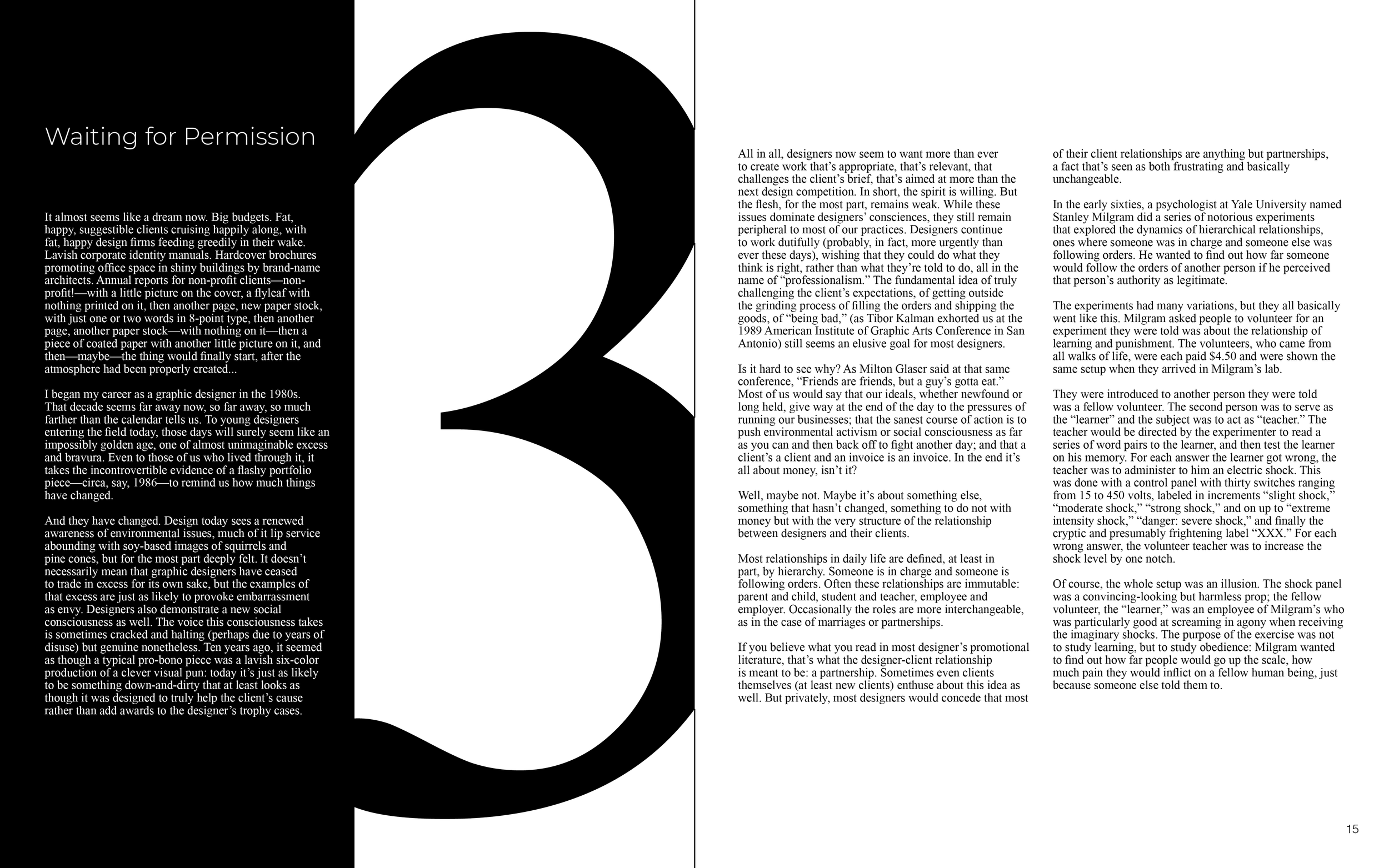
Modern monochromatic
I love a giant number indicating the beginning of a new chapter. I pictured the copy fitting around these gargantuan numbers. Slicing the numbers allowed for more interesting text layout and formatting. As for a color scheme, I went with my tried-and-true, always cool, black and white.
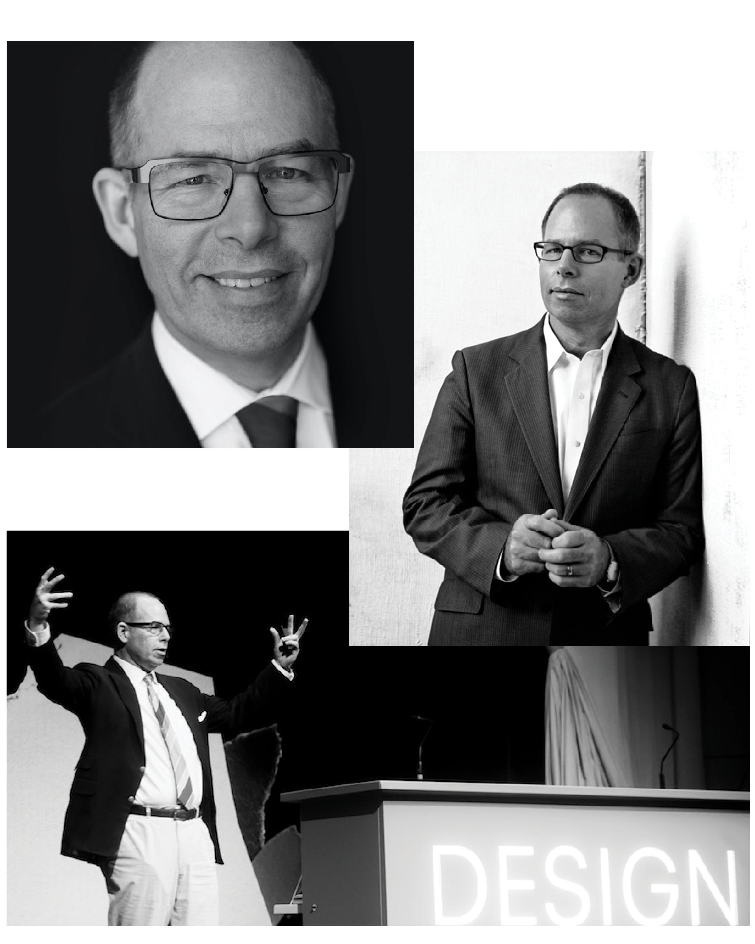
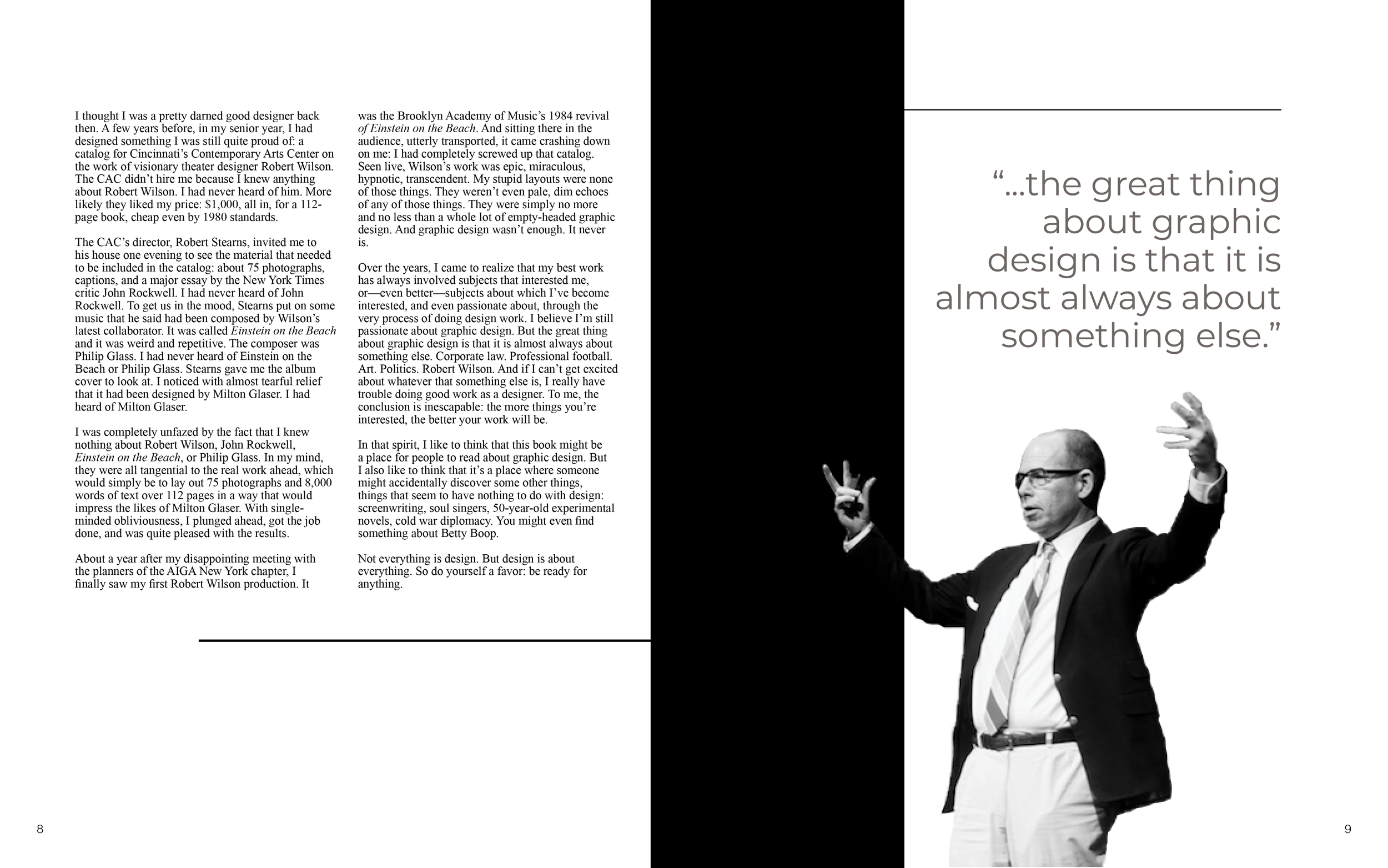
Michael Beirut in the house!
I used images of only Micheal Beirut throughout the book. If this were a re-design of all seventy-nine essays, I would consider using other supporting photography. I narrowed down to a selection of photos and used Photoshop to remove the background. Luckily, these found photos were already black and white but it would have been no problem to mask and adjust otherwise colored pictures.
Creating a cover
My cover followed suit in palette and remained monochromatic. I created a grid with peak-a-boo’s for the book title and subtle patterns to poke through. As fun as some of these symmetrical designs were to create, they were too ornate as compared to the design of the spreads.

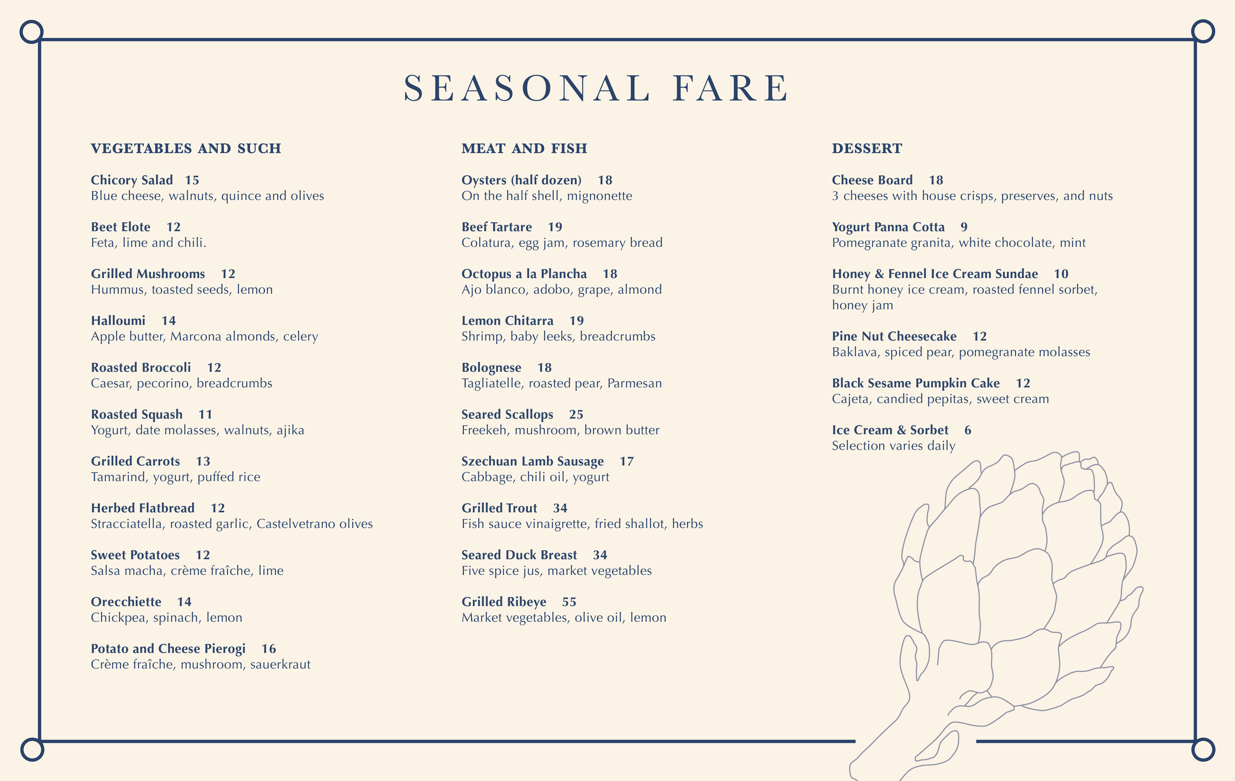
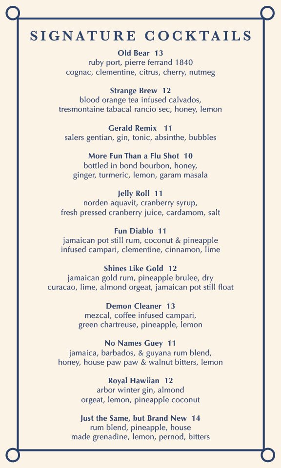
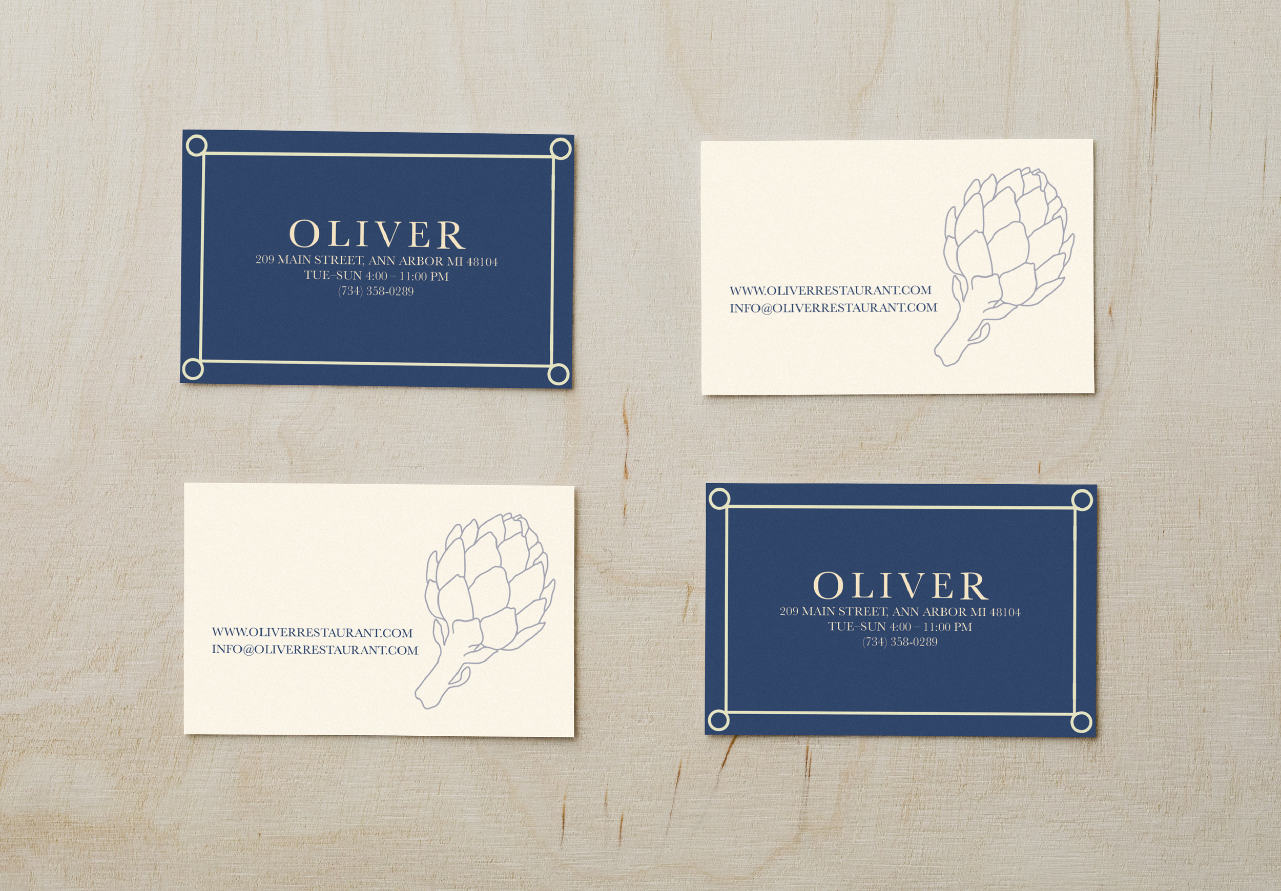
High-end-casual restaurant: Oliver
Oliver is a restaurant in need of a logo, food menu, cocktail menu, and business card. Inspiration for the pub’s ambiance and provisions came from downtown Ann Arbor establishments like The Ravens Club, Aventura, and Spencer. Oliver aims for more refined patronage than a college bar while remaining casual and welcoming.
From acorn to artichoke
The process behind my logo design started with brainstorming images that had somewhat of an abstract association with food. I didn’t want an obvious or kitschy logo. However, I was given feedback that the acorn was simply unrelated and an ill fit. So, I traced an artichoke and kept the lines simple and without shading for a clean and elegant look. The original background color was more green than intended so a hue adjustment was made. Lastly, I framed the logo as I pictured it hanging outside the front door.
Business cards: a tiny canvas
I carried over the typeface, color scheme, and simplicity to the business cards. I wanted to avoid putting too many elements into such a small space. I wondered, what if someone were to find this business card somewhere on the ground face down? The artichoke should immediately link in their brain it was for Oliver. Or, for someone who had never been there, it would intrigue them to pick it up off the ground to find out exactly what it was.
Setting the stage for food and drinks
A place mat style menu was the perfect fit for this establishment. The inspiration came from a recent trip to New Orleans. I had visited a seafood restaurant which used a similar style menu. I generally favor single sheet menus versus hard cover or multiple page menus for the more refined restaurants. It keeps things simple for the customer. It also showcases chefs putting attention to detail to each dish rather than offering a smorgasbord of options.